Vero

The Context

For this concept project, I developed the visual identity of a new skincare brand for a fictional client, including the logo, colours, packaging and webshop. The brand is built on honesty, calm and craftsmanship. The name “Vero” comes from Latin and refers to truth, which fits that honesty. The brief was written with the help of AI.

The Challenge

In a market full of different products, how do you convince people that a few good ones are enough?

The Tools

Ai

The Concept

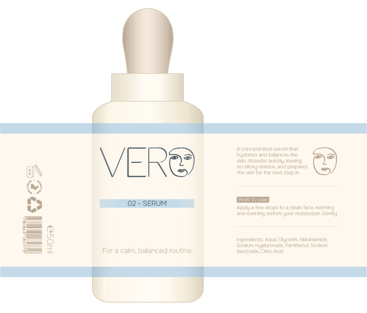
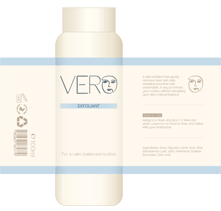
Vero shows that a few good products are enough. Instead of a long list of products and big promises, the brand keeps everything small and clear. It has a short product line, simple packaging and straightforward information about what each product does.

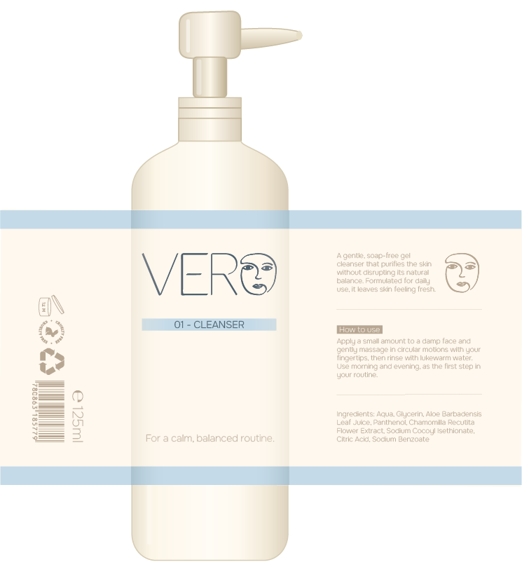
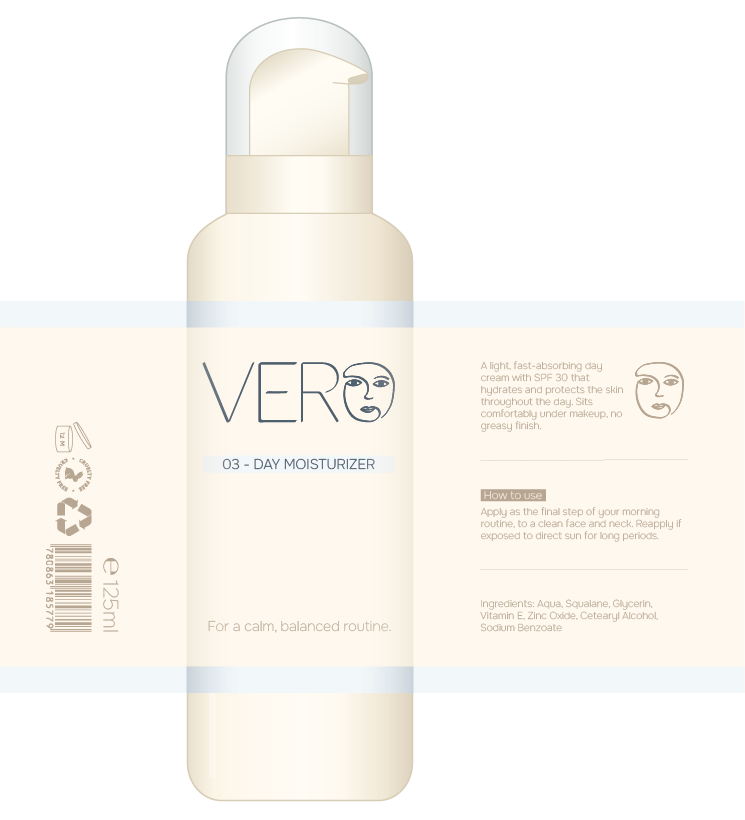
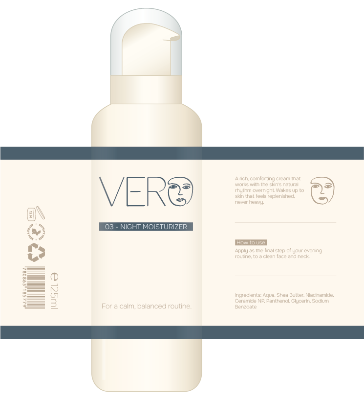
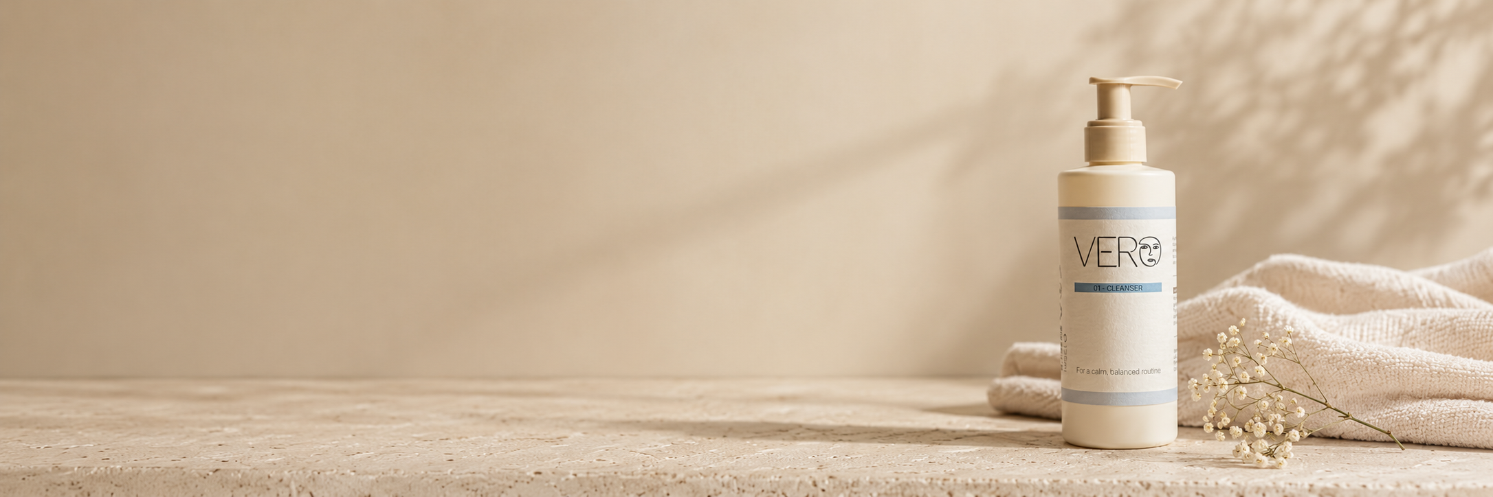
The look sits between clinical and warm, with soft neutral colours, quiet typography and plenty of white space. The label and the webshop follow the same simple style, so the brand feels like one consistent whole.

The Reflection

With Vero, I learned how to translate a client’s wishes and values into a brand, and how to carry it from a logo and packaging all the way to a webshop. Because the client was fictional, I couldn’t check whether this was what they had in mind. Instead, I asked classmates for feedback throughout the process, which helped me test my choices.

The Brand Values

Honesty

No big claims. Clear information about what each product does.

Calm

A quiet look, with soft colours and space to breathe.

Craftmanship

A small line of products, carefully chosen and well made.

The Logo

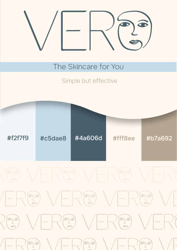
The logo is minimalistic: a thin, simple drawing that shows a simple skincare routine with a few products is enough. The O is replaced by a line drawing of a face, which puts the person at the centre of the brand. The open, light lines keep it calm and honest, just like the products.

The Colours

Vero uses beige as its main colour to bring warmth and keep the brand from feeling too clinical. The soft, natural tone feels inviting and close to skin, which suits a skincare brand that wants to stay approachable.

Blue is the accent colour. It brings trust and calm, and gives the brand a clean, reliable feel that balances the warmth of the beige.

The Packaging

Want to learn more about this project or collaborate on branding design?