Slenter

The Context

For this study project, I had to create a brand around something you normally can’t brand. I chose to focus on the feeling of strolling through a city. The result is Slenter, a brand for city trips. The name comes from the Dutch “slenteren”, which means “to stroll”.

The Challenge

How do you turn a feeling into a brand that people can recognise, remember and experience?

The Tools

Ai

Id

The Concept

Slenter offers city trips where walking is the product. There is no app with routes, no guided tour and no list of hotspots, only a starting point and a mindset: slenteren. The experience begins the moment you step into the street.

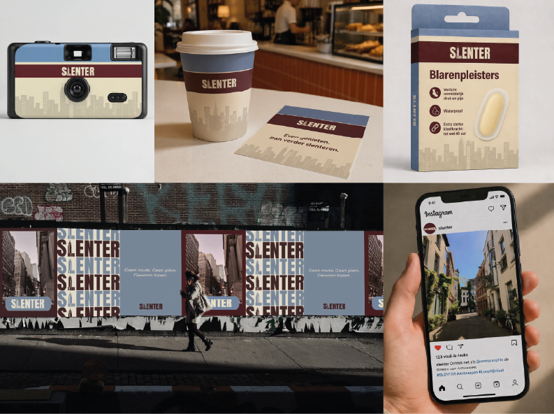
The goal is to help people forget their daily worries by going along with the rhythm and energy of a city. Slenter keeps the trip as empty as possible, with no fixed agenda and no mandatory stops, so travellers can open up to what they find along the way. I developed the full brand: strategy, visual identity and five touchpoints, collected in a brand book.
 

The Reflection

Slenter taught me how to develop a brand from start to finish, from strategy and logo to touchpoints. The hardest part was choosing what to brand, because it had to be something abstract that you don’t normally think about or notice. I chose the feeling of strolling through a city, and let every design choice follow from it. Seeing it all come together is what I’m most proud of.

The Visual Identity

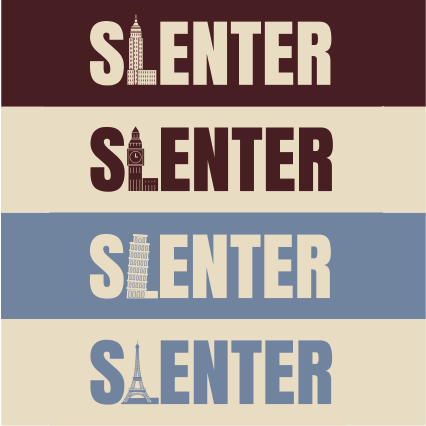
The logo is the brand name in capital letters, with the L replaced by a city silhouette. The building changes per city, so the logo always points to a specific place while the name stays the same. Burgundy and blue are the primary colours: burgundy brings warmth, confidence and character, and blue adds calm and reliability. Cream is the soft, timeless base that keeps everything accessible.

The Brand Promise

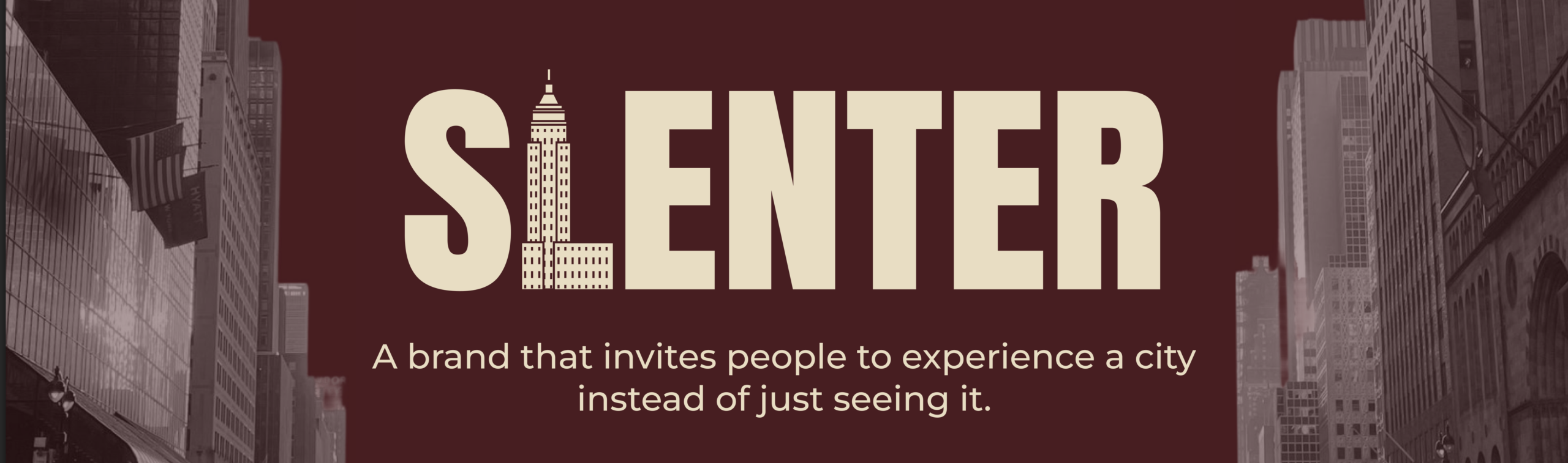
“Slenter promises to let you experience a city instead of just seeing it.”

The Touchpoints

Want to learn more about this project or collaborate on UX design?